/ CASE STUDY 02 / TAX + ACCOUNTING
A tax practice's front door, rebuilt to win the clients referrals send it.
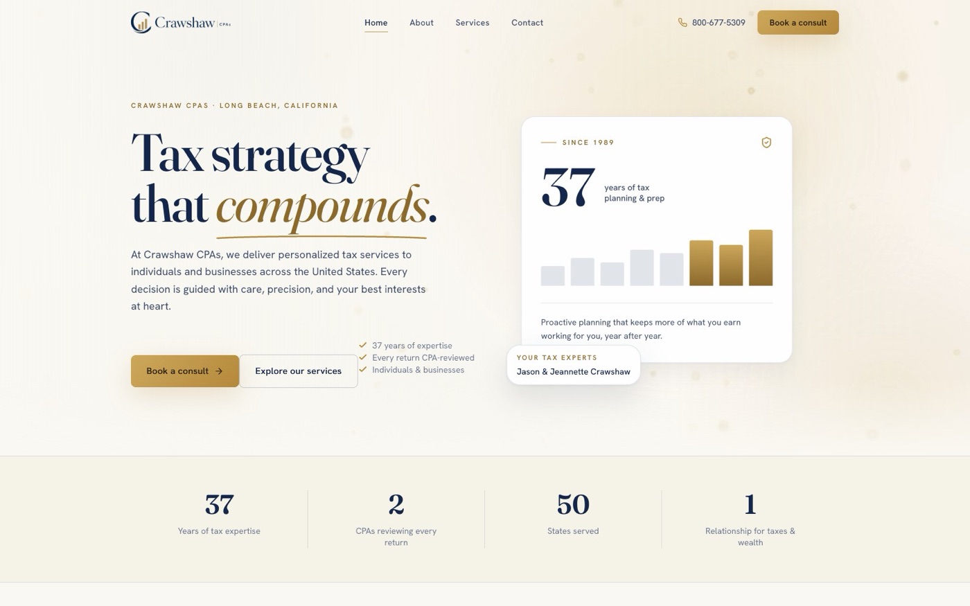
Crawshaw CPAs, a Long Beach tax practice serving clients in all 50 states, had a standard template site that undersold 37 years of work. I rebuilt it from zero.
/ THE PROBLEM
A referral practice with a template front door.
Crawshaw's old site did what most accounting-firm templates do: it existed. Stock layout, generic copy, nothing that said established practice you can trust with your taxes. For a firm whose new business arrives by referral, that is the exact wrong place to be weak.
A referred prospect checks the site before they call. If it reads like a template, the referral leaks away silently. Nobody tells you it happened.
/ THE APPROACH
Restraint reads as trust.
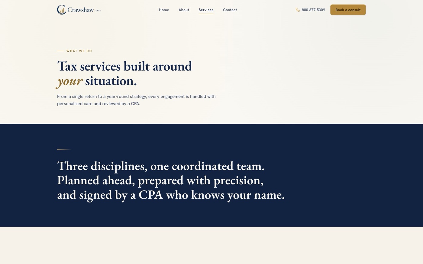
Tax practices earn confidence with composure, so the design language is light editorial premium: warm paper canvas, deep navy ink, antique gold drawn from the Crawshaw logo, old-style serif headlines. Closer to a high-end print magazine than a web template.
It was also built as a deliberate visual sibling to the site I built for William Allan, the wealth-management firm Crawshaw is affiliated with, so the two firms read as one family when a client crosses between them.
/ WHAT I BUILT
The whole front of house.
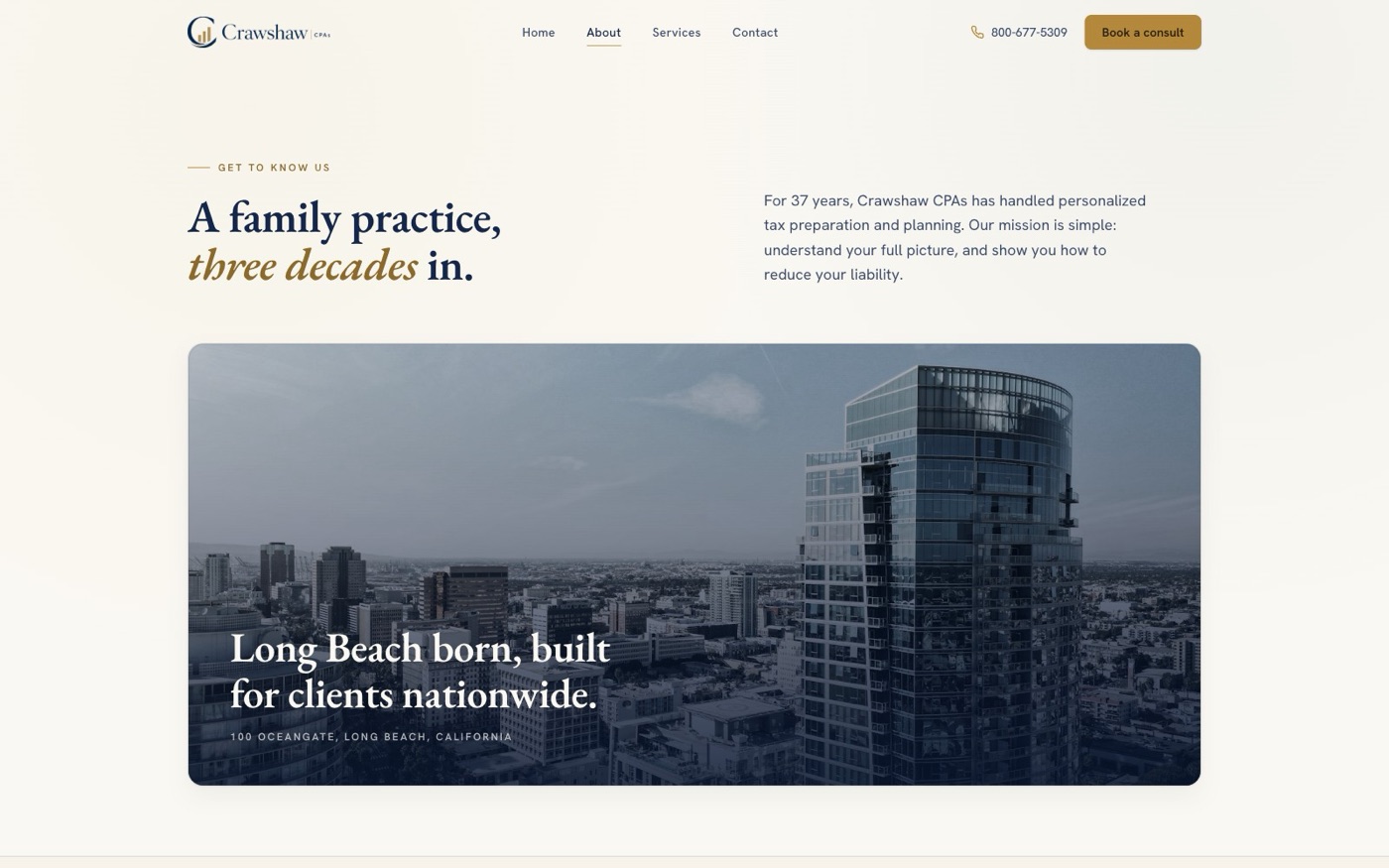
- Full marketing site: home, about and team, services with individual service pages for tax planning, tax preparation, and wealth management, contact, privacy.
- A calm ambient motion hero, rendered as a seamless loop in Remotion, that steps aside for visitors who prefer reduced motion.
- A navy duotone photography treatment that grades mismatched stock into one cohesive, art-directed set. No photoshoot budget required.
- Scroll reveals and micro-motion tuned to feel composed, never flashy.
- Fully static and fast. No page builder, no plugins to break, nothing to patch monthly. Content lives in one structured file that updates in minutes.

The site is the visible layer. The systems behind it are the point.
CLIENT INTAKE THAT RUNS ITSELF / FOLLOW-UP NOBODY HAS TO REMEMBER / AUTOMATION SIZED FOR THE HIRE YOU CANNOT MAKE
Your referrals are checking your website today.
If it is not helping, I will tell you exactly where it leaks. A free look, specific findings, no strings. If you want it fixed, I design and build it myself, and I wire in the systems that do the work of the hire you cannot make.